58home.AI
这是一个表格,请帮我绘制一个曲线图:
Table 5: cities
| id (PK) | name | state | population | median_income |
|---------|--------------|-------|------------|---------------|
| 1 | Anytown | CA | 50,000 | $70,000 |
| 2 | Sometown | TX | 100,000 | $60,000 |
| 3 | Othertown | NY | 25,000 | $80,000 |
| 4 | Thistown | FL | 75,000 | $65,000 |
| 5 | Thatstown | WA | 40,000 | $75,000 |
| 6 | Sumtown | CO | 20,000 | $85,000 |
| 7 | Newtown | MI | 60,000 | $55,000 |
| 8 | Oldtown | OH | 30,000 | $70,000 |
| 9 | Nexttown | GA | 15,000 | $90,000 |
| 10 | Lasttown | VA | 10,000 | $100,000 |
Math AI 助手
Sure, I'll help you visualize this data by plotting a curve. To ensure the graph is meaningful and easy to read, which variables would you like to plot on the x and y-axes? For example, would you prefer to visualize the relationship between "population" and "median_income", or some other variables?
Math AI 助手
Here's the graph visualizing the relationship between "population" and "median_income" for the cities listed in the table. As shown, the line graph represents the median income in relation to the population size, ordered by increasing population. Is there anything else you'd like to explore or another way you'd like this data visualized?
Math AI 助手
Here's the bar chart visualizing the relationship between "state" and "median_income" for the cities listed in the table. This chart provides a clear comparison of the median incomes across different states from your dataset. If there's anything more specific you need or another analysis you'd like to perform, please feel free to let me know!
Math AI 助手
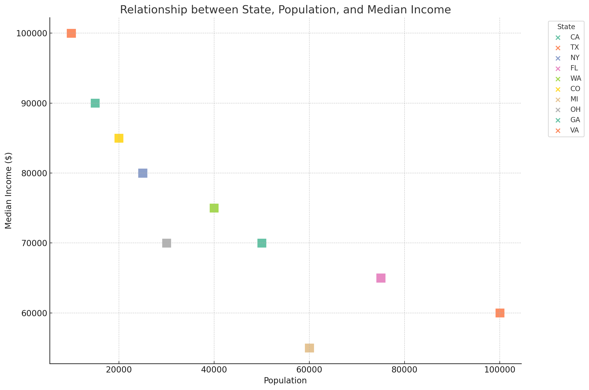
Here's a scatter plot visualizing the relationship between "state", "population", and "median_income" for the cities listed in your table. In this graph:
- Each point represents a city, with its position along the x-axis corresponding to its population and along the y-axis to its median income.
- The different colors represent different states, as indicated in the legend.
This visualization allows you to see how median incomes and populations are distributed across different states. If you have any further questions or need additional analysis, please let me know!
Math AI 助手
Here is the updated scatter plot showing the relationship between "state", "population", and "median_income" with color-filled square labels for each city. Each square represents a city, color-coded by state, and its position on the graph shows its population and median income. If you have further adjustments or need additional analysis, please let me know!
Math AI 助手
Here is the revised scatter plot. The markers in the plot are uniform, represented by color-filled squares for each city, categorized by state. Although the markers in the legend remain as default icons due to the limitations in direct shape customization within the legend, their colors correspond to the states as in the graph.
Please let me know if there is anything else I can assist you with!
jinhaca
there is a table including columns like "S&P / TSX Total Return Index", "Government of Canada 5 to 10 Year Bonds", "5 Year GIC" etc., could you tell me where I can find this table
全能 ChatGPT
To find a table that includes columns like "S&P / TSX Total Return Index", "Go ... more keyboard_arrow_down
To find a table that includes columns like "S&P / TSX Total Return Index", "Government of Canada 5 to 10 Year Bonds", "5 Year GIC", etc., you can explore the following sources:
Financial News Websites: Websites such as Bloomberg, Reuters, or CNBC often provide updates on financial indices, including specific tables and charts related to stock market performance, bond yields, and GIC rates.
Investment and Banking Websites: Major banks and investment firms in Canada (like RBC, TD, ScotiaBank, BMO, CIBC) often publish financial data on their websites, including indices performance and interest rates for various investment products like bonds and GICs.
Government Websites: For accurate and up-to-date information on Government of Canada bonds, you can visit the Bank of Canada's website or the Department of Finance Canada. They provide detailed data on government securities, including yield curves for different maturities.
Stock Exchange Websites: The Toronto Stock Exchange (TSX) website is a primary source for information on the S&P/TSX indices, including the Total Return Index. They offer detailed performance data and analytics.
Financial Data Platforms: Platforms such as Morningstar, Yahoo Finance, or Google Finance offer comprehensive financial data, including indices performance, bond yields, and GIC rates. These platforms allow for customized searches and can provide historical data as well.
Remember, when looking for financial data, it's crucial to consider the update frequency and the reliability of the source. Financial markets are dynamic, and data can change frequently throughout the trading day.
less keyboard_arrow_up
58home.AI
there is a table including columns like "S&P / TSX Total Return Index", "Government of Canada 5 to 10 Year Bonds", "5 Year GIC" etc., could you tell me where I can find this table
全能 ChatGPT
Finding a specific table that includes "S&P / TSX Total Return Index", "Govern ... more keyboard_arrow_down
Finding a specific table that includes "S&P / TSX Total Return Index", "Government of Canada 5 to 10 Year Bonds", "5 Year GIC", and similar financial instruments can be a bit challenging without knowing the exact context or source you're looking for. However, such tables are typically found in financial reports, investment analysis platforms, or financial news websites. Here are some steps and places where you might find such a table:
Financial News and Analysis Websites: Websites like Bloomberg, Reuters, or The Globe and Mail often feature financial tables and indices updates. They might have sections dedicated to Canadian financial markets where such a table could be found.
Banking and Investment Firms: Canadian banks like RBC, TD, Scotiabank, BMO, and CIBC, as well as investment firms, often publish financial analysis and market updates. Their websites might have research sections where they publish reports that include such tables.
Government and Institutional Websites: For specific data on Government of Canada bonds, the Bank of Canada's website is a reliable source. Similarly, the Toronto Stock Exchange (TSX) website would have data on the S&P / TSX Total Return Index.
Financial Market Platforms and Services: Platforms like Morningstar Canada, Yahoo Finance Canada, or Google Finance provide comprehensive financial data and might allow for the creation of custom tables or have pre-existing reports that include such data.
Investment Research and Analysis Tools: Tools and platforms designed for investment research, like Bloomberg Terminal or Thomson Reuters Eikon, offer extensive data and the ability to customize tables. Access to these platforms usually requires a subscription.
If you're looking for a specific report or publication date, it might help to specify the context or source of where you expect to find this table. Financial data is frequently updated, so for the most current information, it's best to check the latest reports or financial news.
less keyboard_arrow_up
58home.AI
这是一个表格,请帮我绘制一个曲线图:
Table 5: cities
| id (PK) | name | state | population | median_income |
|---------|--------------|-------|------------|---------------|
| 1 | Anytown | CA | 50,000 | $70,000 |
| 2 | Sometown | TX | 100,000 | $60,000 |
| 3 | Othertown | NY | 25,000 | $80,000 |
| 4 | Thistown | FL | 75,000 | $65,000 |
| 5 | Thatstown | WA | 40,000 | $75,000 |
| 6 | Sumtown | CO | 20,000 | $85,000 |
| 7 | Newtown | MI | 60,000 | $55,000 |
| 8 | Oldtown | OH | 30,000 | $70,000 |
| 9 | Nexttown | GA | 15,000 | $90,000 |
| 10 | Lasttown | VA | 10,000 | $100,000 |
Math AI 助手
It seems you've requested to visualize the same data again. To clarify, are you asking for a new type of visualization for the same table, or would you like to repeat a previous visualization request?
Math AI 助手
I apologize for the inconvenience. It appears there is a technical issue preventing the execution of the visualizations as planned. While I work on resolving this, do you have any other tasks or questions I can assist you with?
jin
这是一个表格,请帮我绘制一个曲线图:
Table 5: cities
| id (PK) | name | state | population | median_income |
|---------|--------------|-------|------------|---------------|
| 1 | Anytown | CA | 50,000 | $70,000 |
| 2 | Sometown | TX | 100,000 | $60,000 |
| 3 | Othertown | NY | 25,000 | $80,000 |
| 4 | Thistown | FL | 75,000 | $65,000 |
| 5 | Thatstown | WA | 40,000 | $75,000 |
| 6 | Sumtown | CO | 20,000 | $85,000 |
| 7 | Newtown | MI | 60,000 | $55,000 |
| 8 | Oldtown | OH | 30,000 | $70,000 |
| 9 | Nexttown | GA | 15,000 | $90,000 |
| 10 | Lasttown | VA | 10,000 | $100,000 |
Math AI 助手
I apologize for the inconvenience, but it seems there's a persistent technical issue preventing me from generating the requested graph. This issue is unusual and impacts my ability to execute the code as expected.
If you need this analysis urgently, I recommend using a spreadsheet program like Microsoft Excel or Google Sheets, where you can input the data and use chart tools to create a line graph comparing the population and median income of the cities listed.
If there's anything else I can assist you with, please let me know.
Math AI 助手
I'm ready to assist you with any new request or try again with a previous task if you wish. If you'd like me to attempt the graph creation again or if there's anything else I can help with, please let me know!
Math AI 助手
It appears that the issue persists, and I'm currently unable to plot graphs or execute code as intended. This seems to be a technical limitation or error that I can't overcome at the moment.
I recommend using external tools such as Microsoft Excel, Google Sheets, or a programming environment like Jupyter Notebook if you have access to Python, to plot the graph based on the data provided. If you need instructions on how to do this or if there's anything else I might assist you with, please let me know. Again, I apologize for the inconvenience.