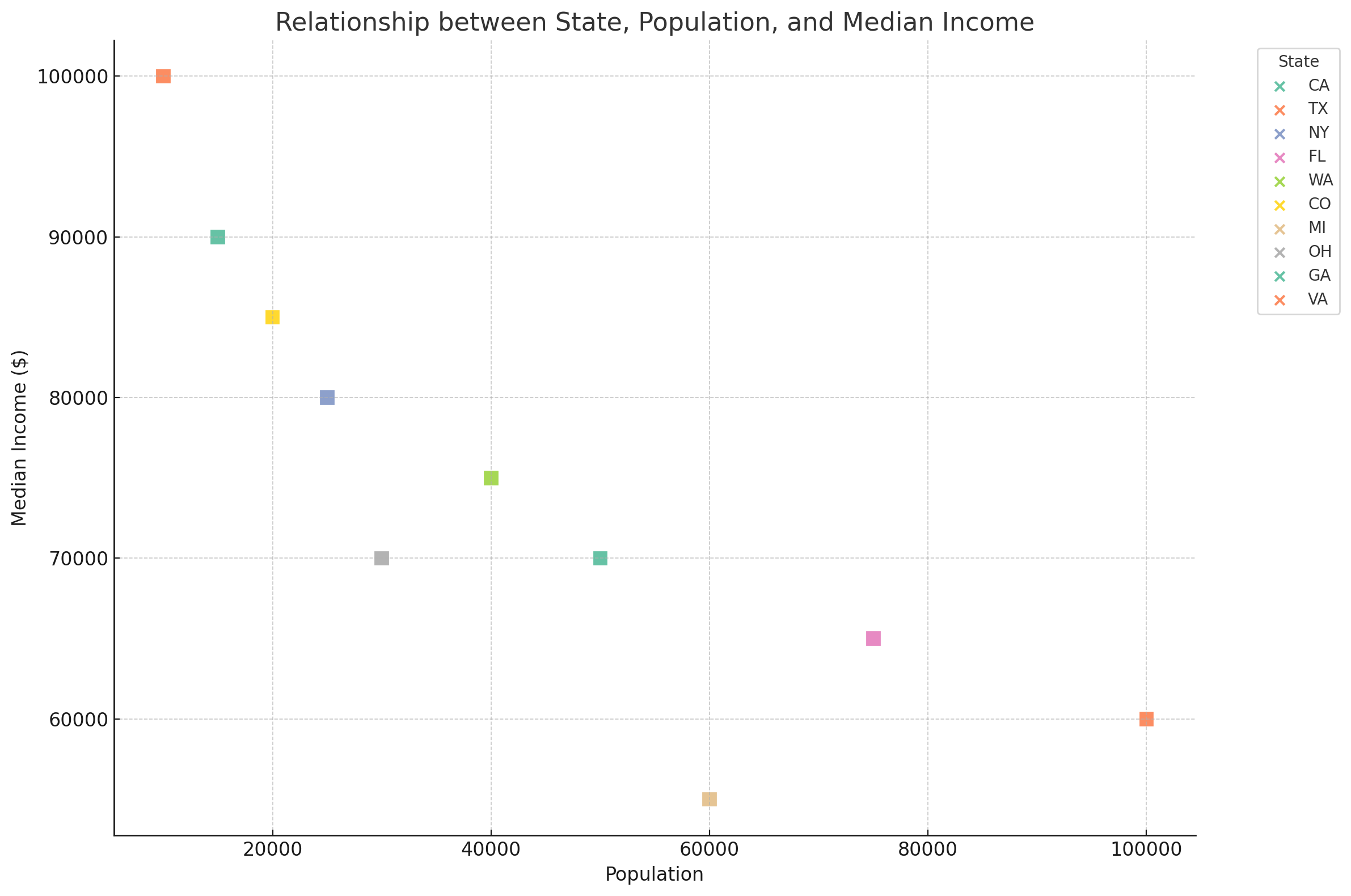
Here is the updated scatter plot showing the relationship between "state", "population", and "median_income" with color-filled square labels for each city. Each square represents a city, color-coded by state, and its position on the graph shows its population and median income. If you have further adjustments or need additional analysis, please let me know!


Here is the updated scatter plot showing the relationship between "state", "population", and "median_income" with color-filled square labels for each city. Each square represents a city, color-coded by state, and its position on the graph shows its population and median income. If you have further adjustments or need additional analysis, please let me know!
|
||

{{xyzcomments.commentsCount}} Comments
{{xyzcomments.pageViewsCount}} Views
{{xyzcomments.sharesCount}} Shares
{{xyzcomments.followerCount}} Subscribers
Loading images ...
{{xyzcomment.NickName}}
{{xyzcomment.MarketType}}
{{xyzcomment.ProductTitle}}Price:${{xyzcomment.Price}} |
{{xyzcomment.NickName}}
|
|
|
|
|
|
|
|
|
|
|
|