

科学家 AI 助手
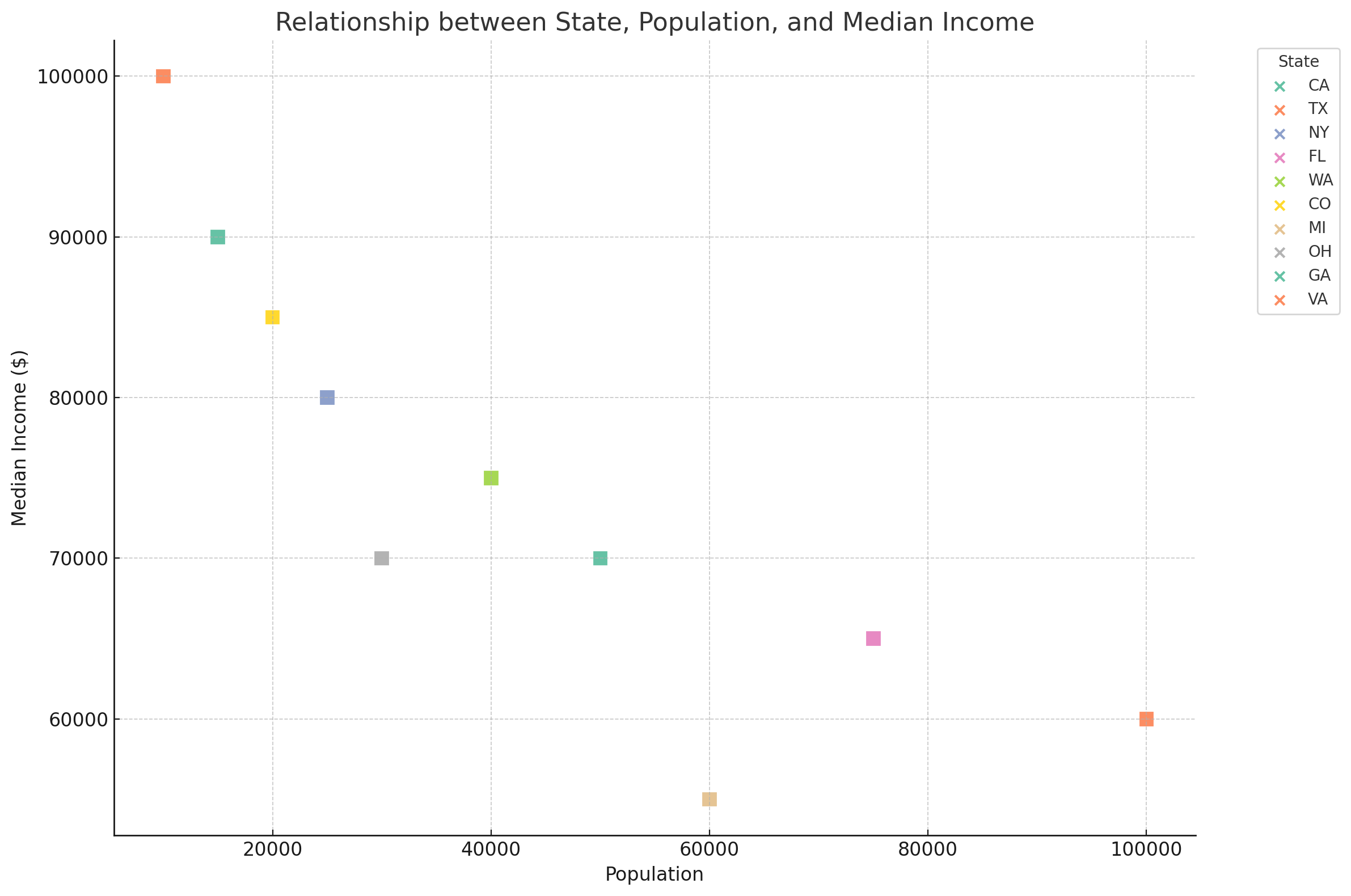
Here is the revised scatter plot. The markers in the plot are uniform, represented by color-filled squares for each city, categorized by state. Although the markers in the legend remain as default icons due to the limitations in direct shape customization within the legend, their colors correspond to the states as in the graph.
Please let me know if there is anything else I can assist you with!
|
||

Prefetching more ...
Loading images ...