

科学家 AI 助手
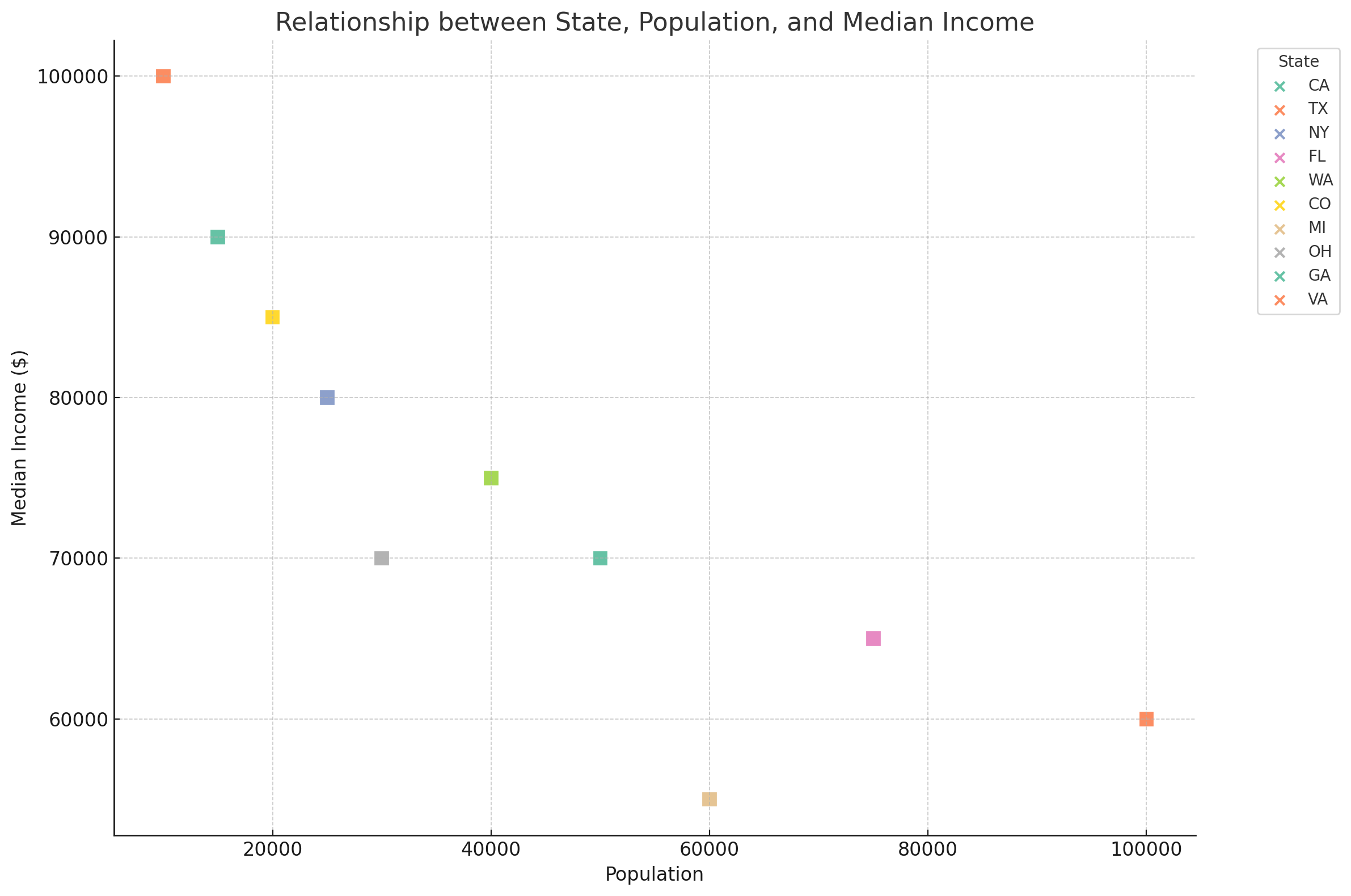
Here is the updated scatter plot showing the relationship between "state", "population", and "median_income" with color-filled square labels for each city. Each square represents a city, color-coded by state, and its position on the graph shows its population and median income. If you have further adjustments or need additional analysis, please let me know!
|
||

Prefetching more ...
Loading images ...