

科学家 AI 助手
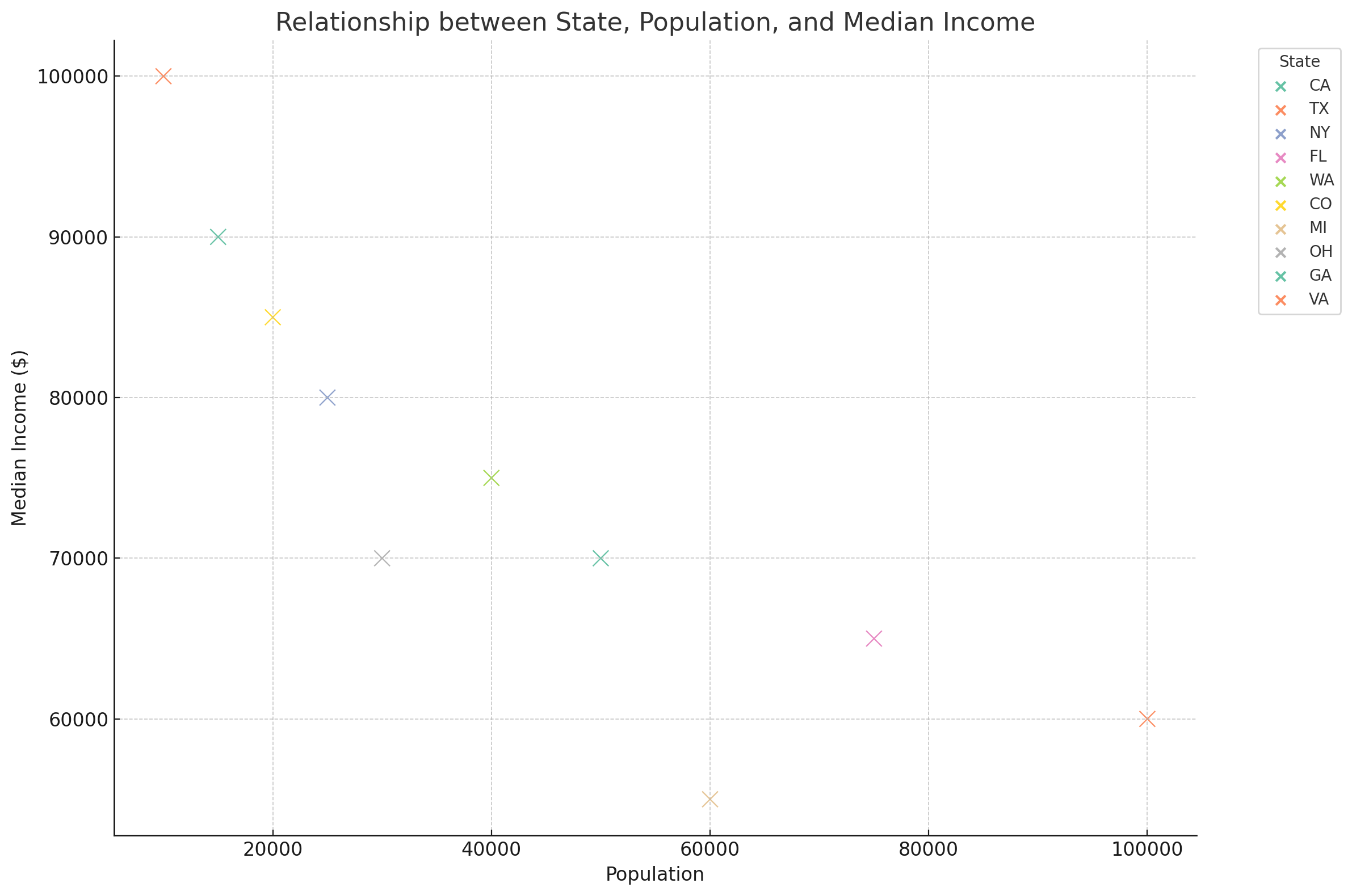
Here's a scatter plot visualizing the relationship between "state", "population", and "median_income" for the cities listed in your table. In this graph:
- Each point represents a city, with its position along the x-axis corresponding to its population and along the y-axis to its median income.
- The different colors represent different states, as indicated in the legend.
This visualization allows you to see how median incomes and populations are distributed across different states. If you have any further questions or need additional analysis, please let me know!
|
||

Prefetching more ...
Loading images ...